How To Choose The Right Wine Packaging Design To Suit Your Brand.
We’ve all been there; standing in a bottle aisle feeling overwhelmed at the wide range and variety of wines to choose from to go with your Friday night spaghetti marinara. When it comes to wine packaging, labels are as functional as they are promotional.
Now that you are one of those brands trying to get noticed by this target exact target market, how will you choose the right wine label for your product?
A (brief) history of wine labels.
Wine labels date back as far as the consumption of wine itself. The earliest production of wine was recorded in 6000 B.C. in Georgia and Iran. Back then wine was stored and transported in Amphorae, ceramic vessels coated in wax such as pine or beeswax. These vessels were often engraved with inscriptions signifying the year, type and quality of the wine.
The first wine labels were actually parchment tied to a bottle with a piece of string.
Lithography simplified the process, allowing labels to be printed in mass quantities. Resulting in increased use of colour and emphasis on design in wine labels. For example, wine producers started preferring rectangular labels as they provided more room to record information about the wine itself. A traditional and functional long-standing trend we of course still see on shelves.
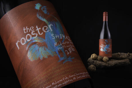
In the 70s, European winemakers began working with artists such as Picasso and Chagall to create unique designs to represent the quality of the product. Today we still see many local artists producing artwork for wineries, it is a beautiful way to make your wine labels uniquely yours and significant to your own region.
While we have come a long way from ancient engravings on the side of ceramic caskets, wine labels have retained their importance throughout history. A wine label is vital for developing visual identity, capturing the customer's attention, and signalling a sense of familiarity so they pick your bottle over others on the shelf.
"A carefully crafted label can make us think the bottle is way more expensive than it is, and it can boost our enjoyment of the wine itself." David Schuemann from CF Napa Brand Design.
Standing out from the masses with the right branding.
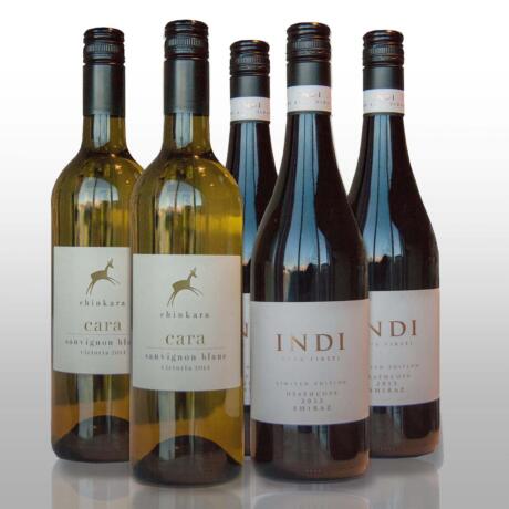
A wine label’s design, imagery and colour can vary across different price points. At the very centre of these elements is its functionality. A good label should contain key elements that consumers can use to analyse the product: The name or brand, the grape varieties and price. Don’t be afraid to show off your personality by also detailing the wine’s history and what to pair the wine with to consume the product at its best (this information is often printed on the back label).
Imagery and illustrations are often paired with wines, in some cases these are popular with the low-mid price categories of wines, with higher-end wines making the use of minimalistic typography and ornamental embellishments to enhance the perception of a more premium product. It is not uncommon that high-end vintages are often associated with minimalistic, uncluttered designs. That’s why the most expensive wines you see on the shelf are designed around a single colour with a simple logo.
The power of colour should not be undermined when designing your label. Loud and vibrant colours can signify to customers that a wine is inexpensive and are often targeted to a younger or a less experienced audience. That is not to say a well-designed coloured label with beautiful embellishments can not attract the exact audience your brand is targeting, design is of course something that is flexible and uniquely yours so getting creative can be just what your brand requires to make an impression!
Colourful labels can be useful to compete for the rare attention of consumers. However, muted tones such as creams are often perceived as being more sophisticated and related to high-end wines. Black and navy can also be used to signify a wine’s premium stature.
When your target audience is searching for the right bottle to pair with their spaghetti marinara your product only has a snippet of time to attract your buyer so gaining attention quickly is required.
While everyone loves a sophisticated gold foil, the options are endless when it comes to embellishments to make your wine label design stand out from the masses on shelf. Using an embellishment that tells the story of your brand with a raised embossed effect or foiling can help customers recognise your brand, flavour or category quickly and easily.
Embellishments and special effects don’t end with just a gold foil. A custom colour, unique card stock or special design effects can include unique label shapes, clear labels, raised print or of course foiling.
A label that grows with your business.
No matter what your style, it is important to keep in mind that the wine and beverage industry moves quickly. Therefore, staying flexible so your business can take advantage of opportunities such as releasing new products, limited edition products or even trialling a new release can be a great way of making sure you are ready to take advantage of any seasonal or industry opportunities that arise quickly, and with less financial risk.
At Read Labels and Packaging, we offer wine labels at lower minimums than most, by using digital print technology to produce high-end labels that impress. Our print runs can easily include multiple SKUs enabling you to stay flexible and get noticed as you grow your business.
Request a FREE sample pack from our team so you can see, touch and try our product labels for yourself and connect with us now for a quick quote.
Find out more about how our labels are made and what we can do by watching our explainer video HERE.