KETO EATS AUSTRALIA - PANTRY ESSENTIALS THAT REALLY ATTRACT ATTENTION.
Our good friends at Keto Eats are paving the way for Aussies going Keto. With a huge range of products to feed those on the low-carb, higher fat diet and make everyone else totally jealous with the large selection of options!
We recently spoke to one of Keto Eats regular packaging designers Sam, from SJW Creative Design about the importance of good design when it comes to food packaging, so we thought it fitting to ask about the inspiration and process behind the Keto Eats Pantry Range packaging that really attracts attention both on shelf and online. Read the blog on the Importance of good design HERE.
Design brief
For the recent Keto Eats Australia Pantry Range, Sam had the design freedom to really go for it when it came to the design (A designer's dream!). Knowing that Keto Eats had established products flying off the shelf in Stand Up Pouches, digitally printed here at RLP (Read Labels & Packaging) the packaging type was determined, but as for the design.free range to think outside the box.
"The main reason for re-designing our packaging was due to expanding our current range. We wanted to ensure that it was delivered to market as a new range and not just an extension of our existing products which were quite limited."
Stef - Keto Eats.
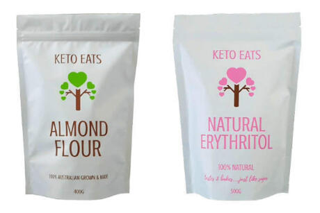
With the original packaging for the range being plain white, with very little detail, it was a great opportunity to really make an impact with a new release of packaging. As we know, a new release of packaging can make an instant difference to sales, both on shelf and online, so it was great to be part of that change for Keto Eats Australia and the change in design is a welcome one...
Before SJW Creative Designs new packaging design...

Considering the target market
"With the category already established in the market exploring the target market and competitors in the same space was essential to ensuring Keto Eats Pantry Range stood out to the consumer when it hit the shelf. We soon found that the 'traditional' kind of designs were already being represented and seen on the shelf, so it was time to shake it up a little and go with something 'fun' that was easily recognisable as Keto Eats, while really catching the eye of potential consumers on shelf". Sam - SJW Creative Design
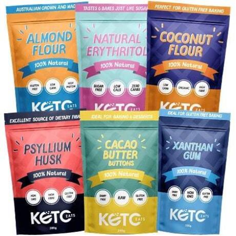
The 'After', an eye-catching range of products that have been flying off the shelf!

Design elements
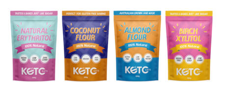
Beginning with an initial range of four products, it was important to design a range of core products that could be expanded upon, and have 'roots back to the original design'.
The brighter colours and elements were fun one to come up with for Sam. Knowing the need for possible expansion in the future, it was essential that the colour choices could grow with the range, keeping it easily identifiable for consumers and aligned with the core brand itself.
Results
When the Keto Eats team contacted Sam about the new packaging design, they were an open book with no real idea on direction or the look they were after. After being presented with a range of ideas from they were thrilled with the look and feel of the range and the results have been astounding since they hit the shelf with "the new packaging increasing our sales by around 300% on the existing products, and the new products have been very well received also" Stef - Keto Eats.
The new designs have been well received by the market.

"In our mind, it's the packaging that really sells the product to begin with - especially online. When it comes to online sales, it is an absolute must to not only have a great design to help sell the product initially but to also have top quality packaging to help deliver a great customer experience when the product is received by the consumer. Overall, we couldn't be happier with the product and service we have received from both Sam and Read Labels & Packaging" Stef.
Flexible Packaging Solutions

With the capabilities of printing multi-sku print runs, our stand-up pouches are a great option for brands with both a core range of products. Easily adaptable to suit most branding and packaging designs they allow you to create a big impact on the market without a big investment in stock. Our minimum print run options are great for testing the market with a new product.
Sealed for freshness, and resealable, they are a great option for food and pantry items. Consumers love them for their ease of use and ability to keep opened products fresher for longer.
Speak to the experts about your packaging needs, and let's get started on getting your brand on shelf sooner.
Thanks to Sam @sjwcreativedesign for his insight into what it took to design eye catching packaging options for Keto Eats Australia. Visit his portfolio for HERE and read up on Sam's advice on 'What makes importance of good design' HERE.
For all your Keto Eats product, get shopping at https://ketoeats.com.au/ and view the range.